IHX Case Study B2B SaaS WebApp Health InsurTech

Reimagining
IHX Nucleus Ops Dashboard
for 18,000+ Healthcare Providers

A 4-bucket layout was hiding a multi-stage, two-team operation across 35+ insurance payers. Nobody had fixed it because nobody had asked how hospital teams actually work. We did.

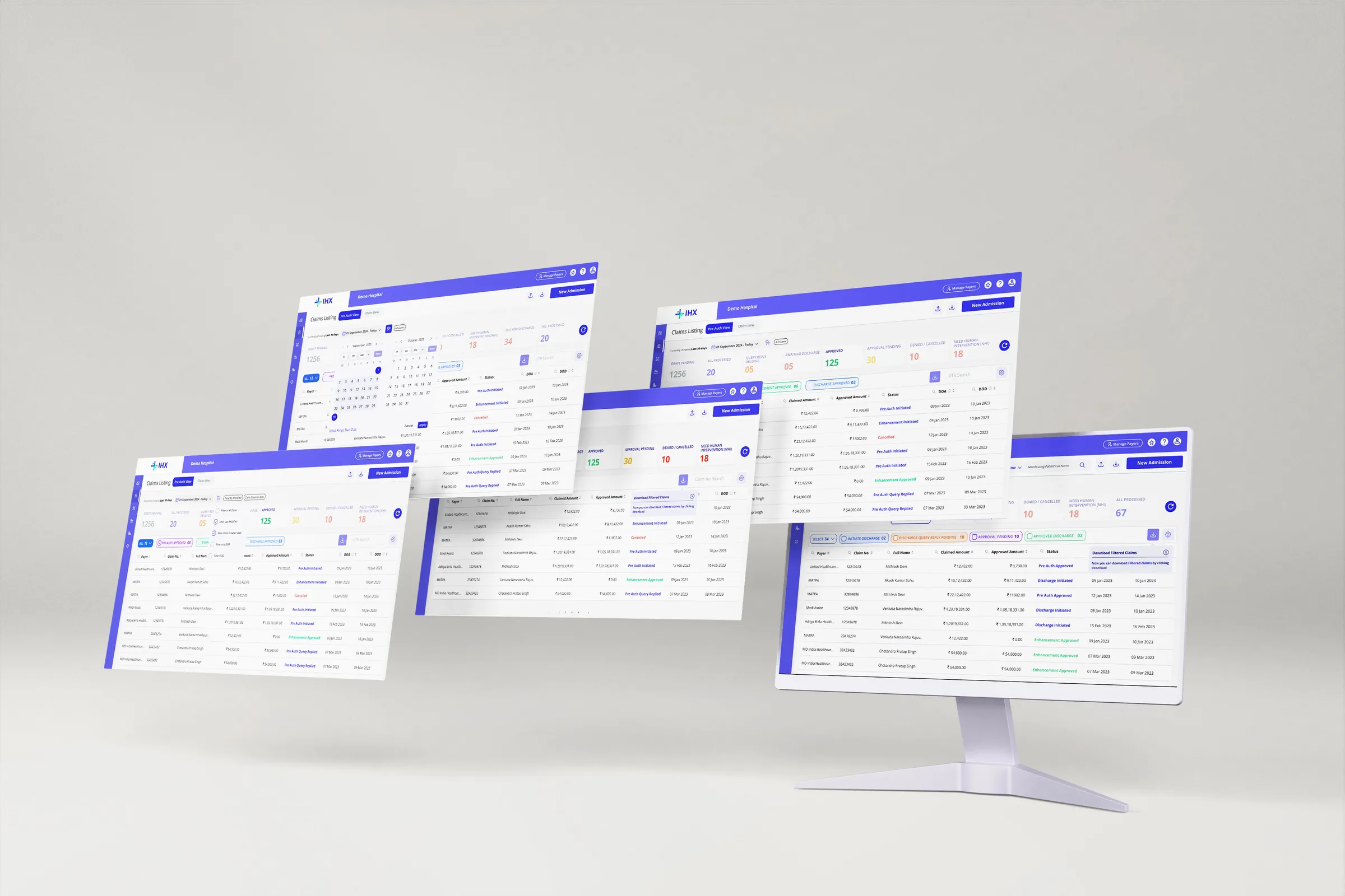
IHX Nucleus Ops Dashboard UI showcase
RoleProduct Design · UX Research · IA · UI · Prototyping · Usability Testing
Team1 PM · 1 PD (me) · 2 Developers
Timeframe4 weeks · Mar–Apr 2025
Also CoveredDev Handoff · Design Review · Stakeholder Management
Revenue
↑33%
Revenue per claim, INR 90 to 120

Time on task
3.23 → 1.56 min
Average per task, a 51% reduction
Contracts
3
Group hospital contracts secured

The whole story, in five cards.

Problem

The brief said redesign the UI. The real problem was information architecture.

Evidence

The old dashboard did not reflect the hospital workflow, so users searched around it.

Solution

Separate PA View and Claim View, each with its own buckets, filters and scoped search.

Numbers

↑33% revenue per claim. Time on task 3.23 → 1.56 min. 3 group hospital contracts.

Takeaway

Let data answer design questions. Make platform decisions that hold for everyone.

What is IHX?

The digital backbone for hospital insurance operations across India. Hospitals manage the full claim lifecycle without logging into 35+ different insurer portals.

2,00,000+
Claims processed monthly
18,000+
Healthcare providers on platform
40%
India's overall claim volume
35+ Payers
Insurance payers connected
Architectural Reality

Of 35 payers: 7 via direct API · 28 via RPA and email extraction. When automation fails, claims disappear. The hospital has zero visibility. We had to design for that failure mode.

The Brief vs The Real Problem

The digital backbone for hospital insurance operations across India. Hospitals manage the full claim lifecycle without logging into 35+ different insurer portals.

The Brief
"Redesign the dashboard"

Make it look better. Clean up the UI. Better visual design.

Assumption This is a UI problem.
Hospital Needs An easy way to manage claims
Business Goals Retain hospitals and secure new ones
VS
The Real Problem
Information Architecture

A multi-stage, two-team operation (pre-auth, enhancement, discharge, settlement, reconciliation across 35+ payers) flattened into 4 buckets and called an Operations Dashboard.

Root Cause Information architecture problem, not a UI problem.
Why Solve This When hospital staff cannot find what they need, queries go unanswered, discharges get delayed, and IHX loses the client.

"The platform had been inherited from a parent insurance company. When IHX became its own entity, nobody had gone back and asked how hospital teams actually work. The screen reflected the logic of the company that built it, not the people using it."

From discovery research

Three sources of evidence shaped the direction before any design decisions.

Hotjar session recordings, Google Analytics event data, and user feedback direct and indirect routed through account managers gave three different angles on the same problem.
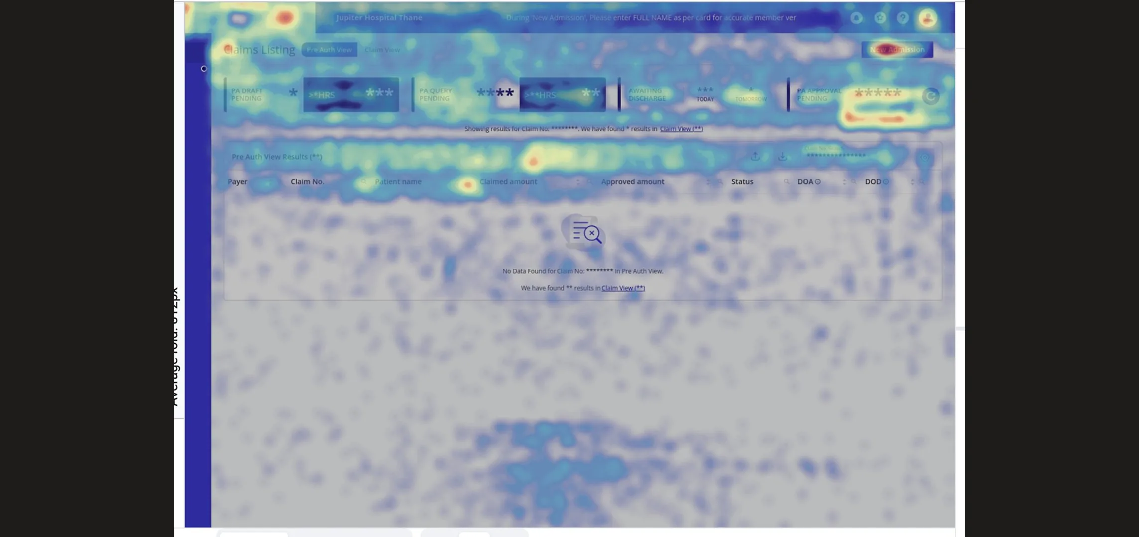
Hotjar · Session Heatmap
Hotjar

The heatmap showed heat concentrated at the top of the screen. New Admission, the search fields, and the Approval Pending bucket. The table body was cold. Users were not browsing. They were searching.

Google Analytics · Events Data
80%+

Of all column level searches used just 2 parameters: Patient Name, Claim Number. UTR had low usage but stays essential for Claim team

From discovery research

Reading across both sources (the cold table in Hotjar and 42% of search events concentrated on just two parameters in GA), the pattern points to one conclusion: users were not finding what they needed through the bucket structure. They were relying on search as a workaround.

Synthesis across Hotjar + GA

User Comments

"If there's a query pending at the discharge stage, I don't even get to know. I can't tell my team to start working on it."

Hospital Insurance Head

"Our claims are all mixed up. Patients come and ask us whats the status, i have to search the claim every time, we are really busy you know ?"

Hospital Insurance Staff

"So much work! I keep searching for claims ready for discharge. If I miss one, patient discharge gets delayed and my supervisor scolds me"

Hospital Insurance Staff

"Hospitals scold us asking why are we paying, why cant you guys add global search feature ?"
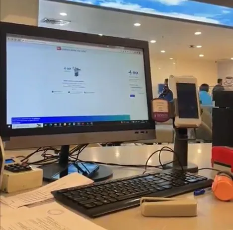
IHX Account Managers
Hospital
15+
Users interviewed
5+
Hospitals covered
6+
Teams represented

A hospital insurance operation is not one workflow. It is two.

I spoke with account managers, sat with the PM, and had direct conversations with hospital staff. What I found was two distinct operations, each with different pressures, timelines, and a completely different relationship with the platform.

Pre-Auth Team
⚡ Time-critical ⚡ Patient facing
·Initiates the claim before the patient is admitted
·Responds to insurer queries on missing documents or procedure clarifications
·Raises enhancement requests
·Initiates discharge when the patient is medically ready to leave

Every action is time-critical: an unanswered query increases TAT, a delayed discharge costs the hospital a bed/hour.

Claim Team
💰 Finance-critical ⚡ Settlement focused
·Submits the formal claim to the insurer after discharge is approved
·Initiates settlement in bulk at end of day across multiple payers
·Resolves finance-level queries that affect the settlement timeline
·Reconciles payments against the hospital contracted tariff / MOUs

Every delay means money already spent on care sitting unreturned, impacting operational capital.

Supervisors / Team Heads
⚡ Time-sensitive ⚡ Management critical ⚡ CXO facing
·Opens the dashboard to understand the team's workload at a glance, not to take action directly
·If a query has been sitting unanswered, they will reach out to their staff immediately
·Needs to see counts across multiple sub-statuses simultaneously to assess team performance
The dashboard is a supervision and oversight tool, not an action tool

Every unanswered query and delayed discharge is visible to them first. They are accountable for the team's turnaround time.

Ecosystem Reality

The users work in a high pressure, highly sensitive environment. The user faces high cognitive load: talking to multiple patients, submitting cases, and answering queries by coordinating with department heads. They are easily frustrated when the platform adds to that load instead of reducing it.
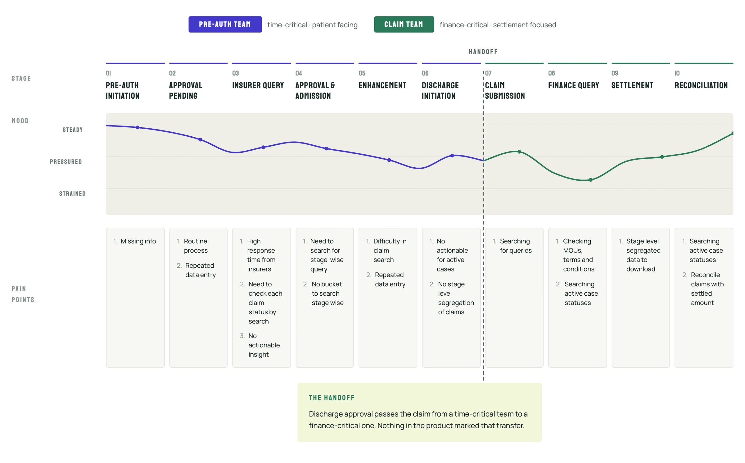
From discovery research
Claim lifecycle journey map: ten stages from pre-auth initiation to reconciliation, the team's mood from steady to strained at each stage, the pain points under each, and the handoff from the Pre-Auth team to the Claim team at discharge approval
User Journey Mapping

Two teams. Two urgency profiles. Two completely different reasons to open the platform. The old UI treated them as one user with one need.

From discovery research

Information Architecture Revamped

The problems were not fixable at the surface because the surface was built on the wrong model. I had two options. Improve the existing screen or restructure the underlying information architecture. I chose the harder one.
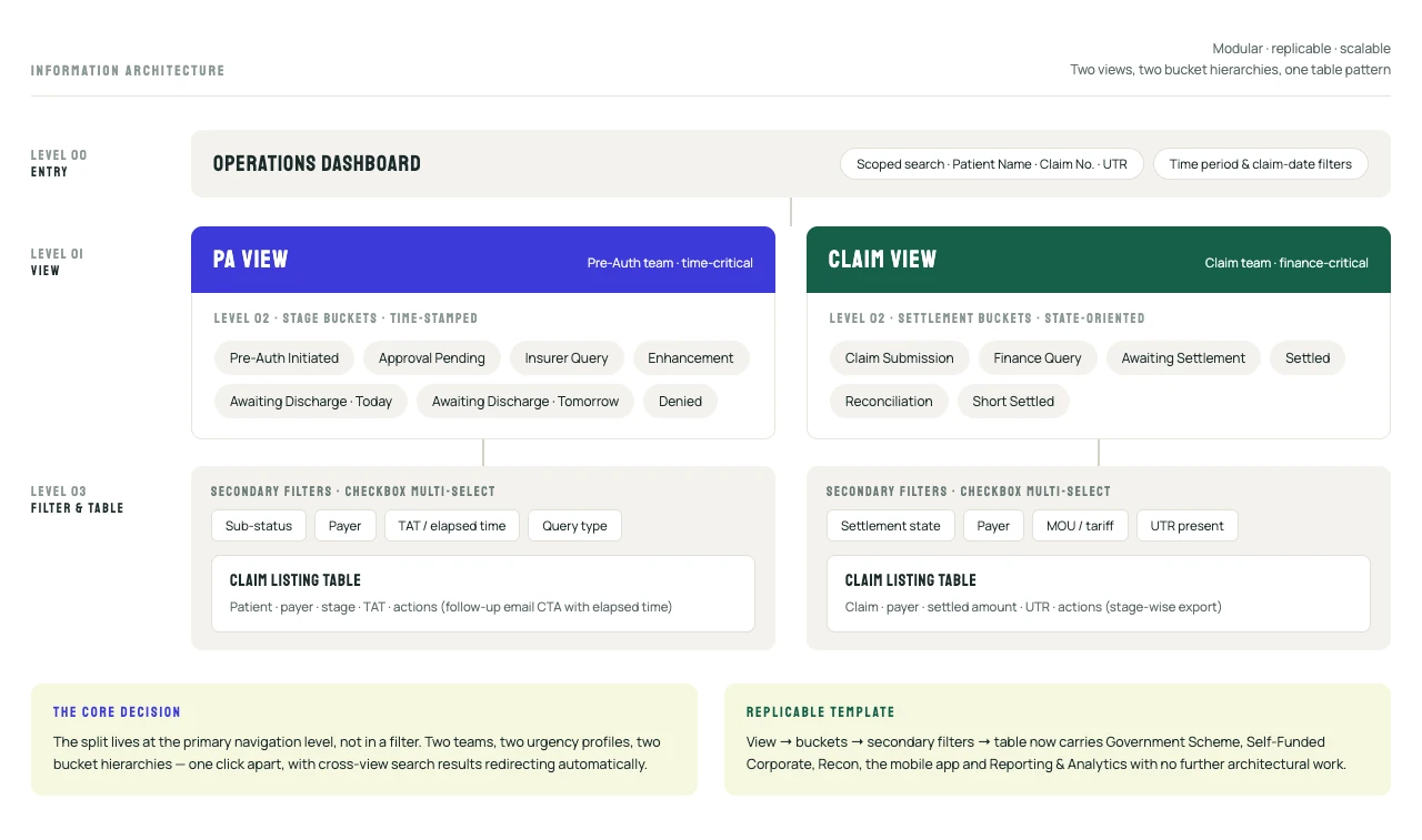
New Information Architecture · Modular · Replicable · Scalable
Information architecture: the Operations Dashboard with scoped search and date filters at level 00, splitting into a PA View and a Claim View at level 01, each with its own stage or settlement buckets at level 02, and secondary filters over a claim listing table at level 03
PA View → Stage Buckets → Secondary Filters → Table  |  Claim View → Settlement Buckets → Secondary Filters → Table
The Scalable Architecture

The PA View / Claim View template with nested bucket, secondary filter, and table became the foundation for the Government Scheme module, Self-Funded Corporate module, Recon module, IHX Nucleus mobile app, and the Reporting & Analytics module, all on the same pattern without additional architectural work.

4 Rounds. Testing as process, not just validation.

2–3 hospitals per round, covering Pre-Auth staff, Claims staff, and supervisors. Key decisions were made or remade through testing.
Round 01
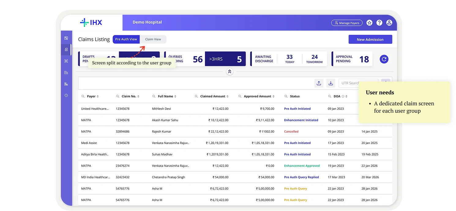
Both user groups found their own view without guidance.
  • The PA / Claim split, the core architecture decision, was confirmed
  • The Discharge Tomorrow bucket did not matter to the Pre-Auth team, so it was removed
  • Buckets were recommended per user group
Round 1 prototype: the Claims Listing split into Pre Auth View and Claim View, with a note on the user need for a dedicated claim screen for each user group. PA / Claim Split Validated
Round 02
The nested structure was understood. Bucket names needed work.
  • Bucket names changed to match hospital vocabulary
  • Users asked for a date filter
  • Supervisors needed to see several statuses at once, which led to the multi-select filter
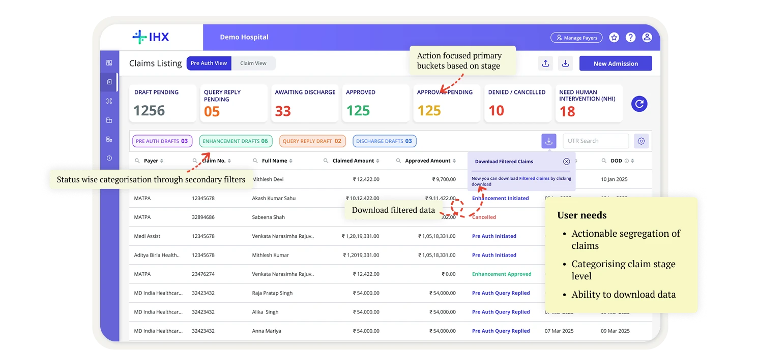
Round 2 prototype: action-focused primary buckets by stage, secondary filters for status, and download for filtered data. User needs: actionable segregation of claims, categorising claim stage level, ability to download data. Label Refinement Needed
Round 03
Bucket names finalised. Multi-select and date filter added.
  • Bucket names finalised from 5 hospitals
  • Checkbox multi-select built
  • Date filter introduced
  • Global search flagged as an engineering constraint, which started the scoped search decision
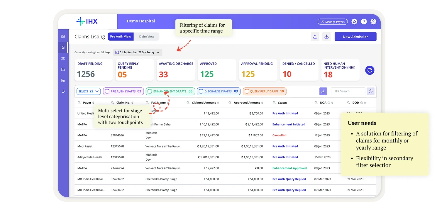
Round 3 prototype: a date filter for a specific time range and multi-select secondary filters. User needs: filtering claims by monthly or yearly range, flexibility in secondary filter selection. Filters & Search Locked
Round 04
Search and the follow-up feature validated.
  • Partial-match search across Patient Name, Claim Number and UTR accepted
  • Follow-up feature validated
  • Elapsed time set per payer confirmed as necessary
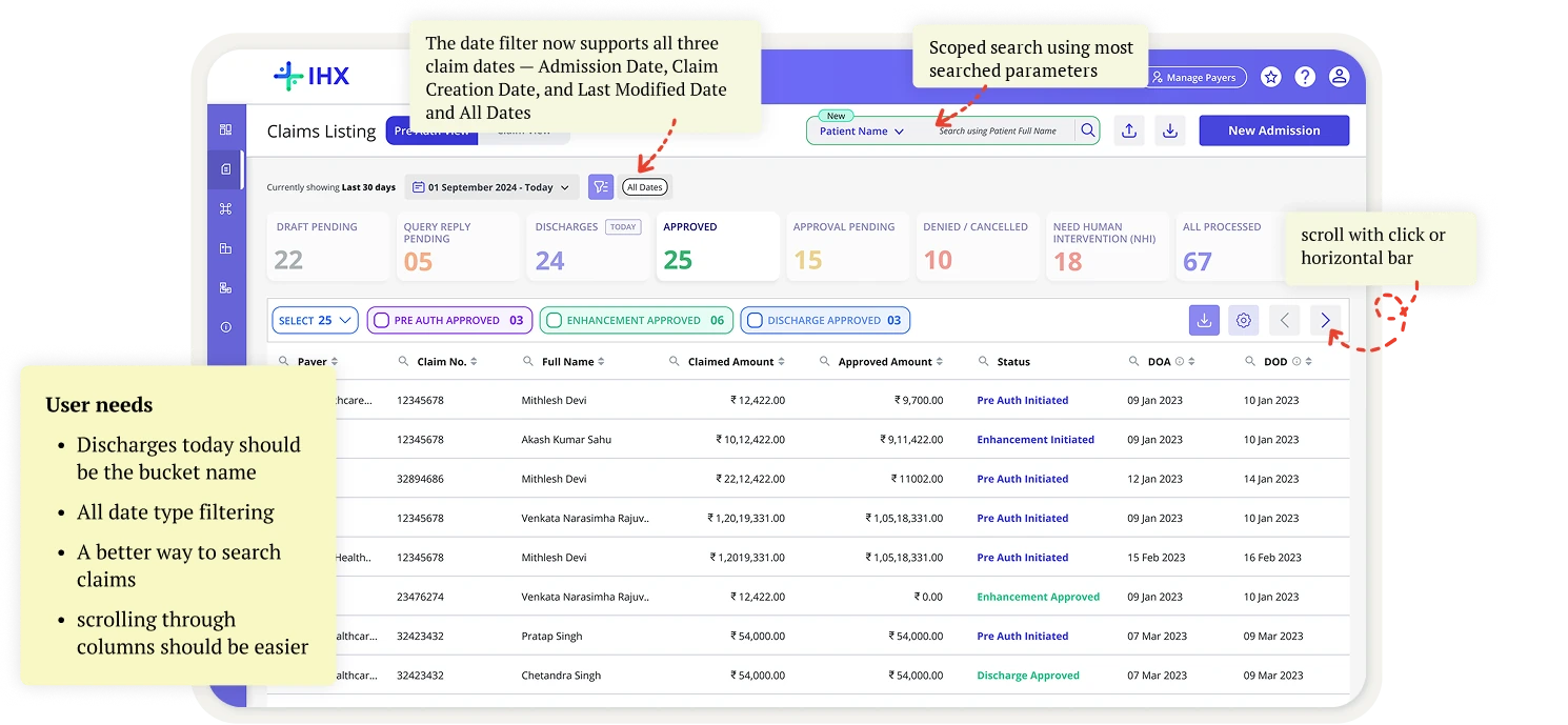
Round 4 prototype: the date filter covers all three claim dates, scoped search by Patient Name, Claim Number and UTR, the most searched fields in Google Analytics, and click or bar scrolling for columns. User needs: Discharges Today as the bucket name, all date type filtering, a better way to search claims, easier column scrolling. Scoped Search Accepted

What Changed on the Ops Dashboard

User Pain Points and Improvements

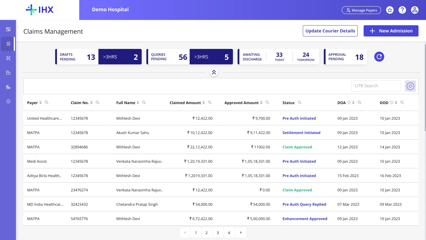
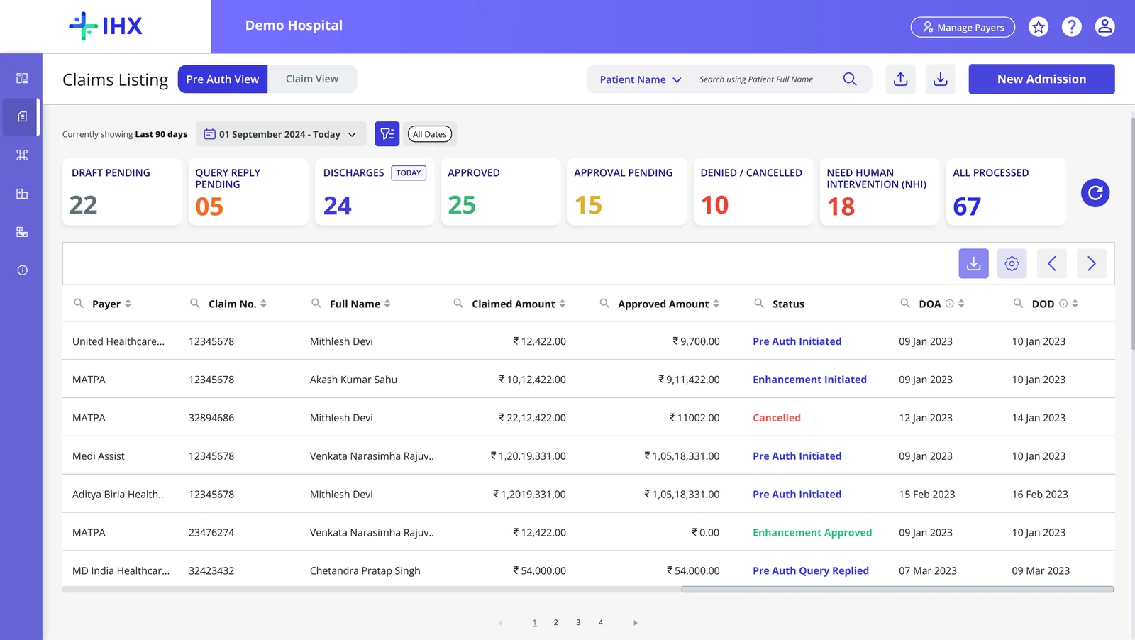
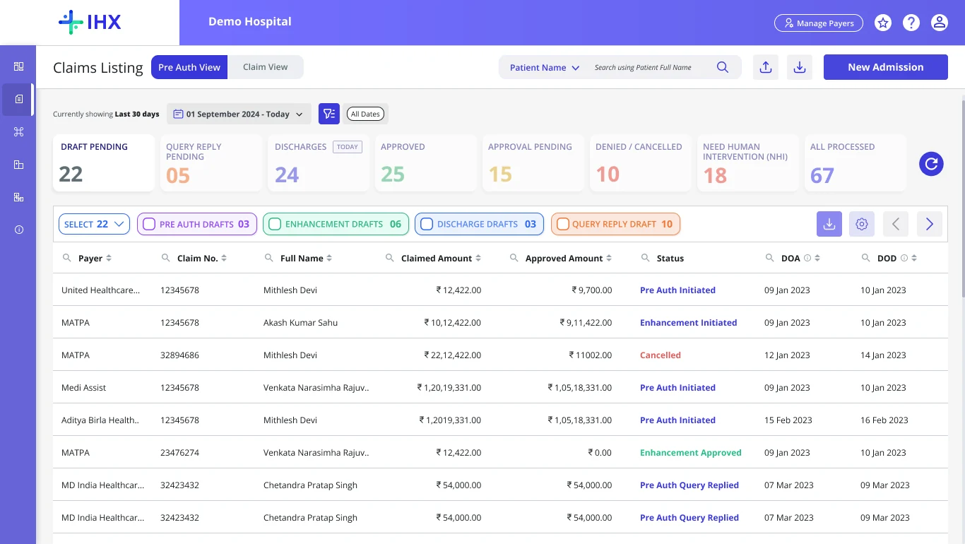
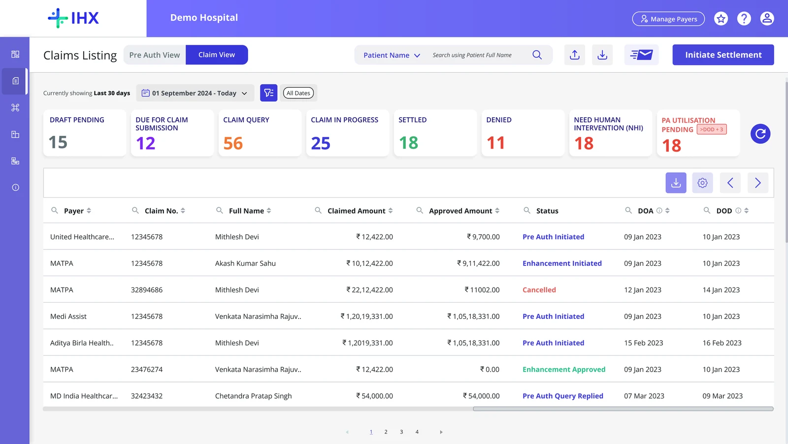
Before: the old Claims Management dashboard, one table for every user group. After: the Pre Auth View with colour-coded buckets, a date filter and patient name search. After: Draft Pending expanded into secondary buckets by draft type. After: the Claim View with claim-stage buckets and the Initiate Settlement button.
Pain points

    Key decisions and why.

    The problems were not fixable at the surface because the surface was built on the wrong model. I had two options. Improve the existing screen or restructure the underlying information architecture. I chose the harder one.

    01
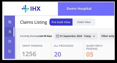
    Separated PA View and Claim View at the primary navigation level

    Two tabs, two user groups, two bucket hierarchies. Pre-Auth buckets are time-stamped: Awaiting Discharge shows today and tomorrow separately. Claims buckets are settlement-state-oriented. Navigation is a single click; cross-view search results redirect automatically.

    Core IA Decision
    PA View Claim View
    02
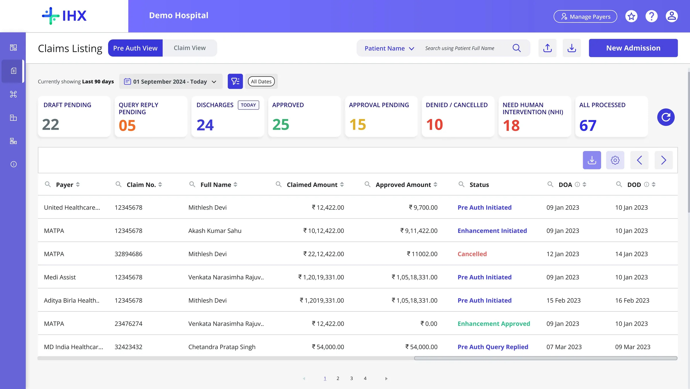
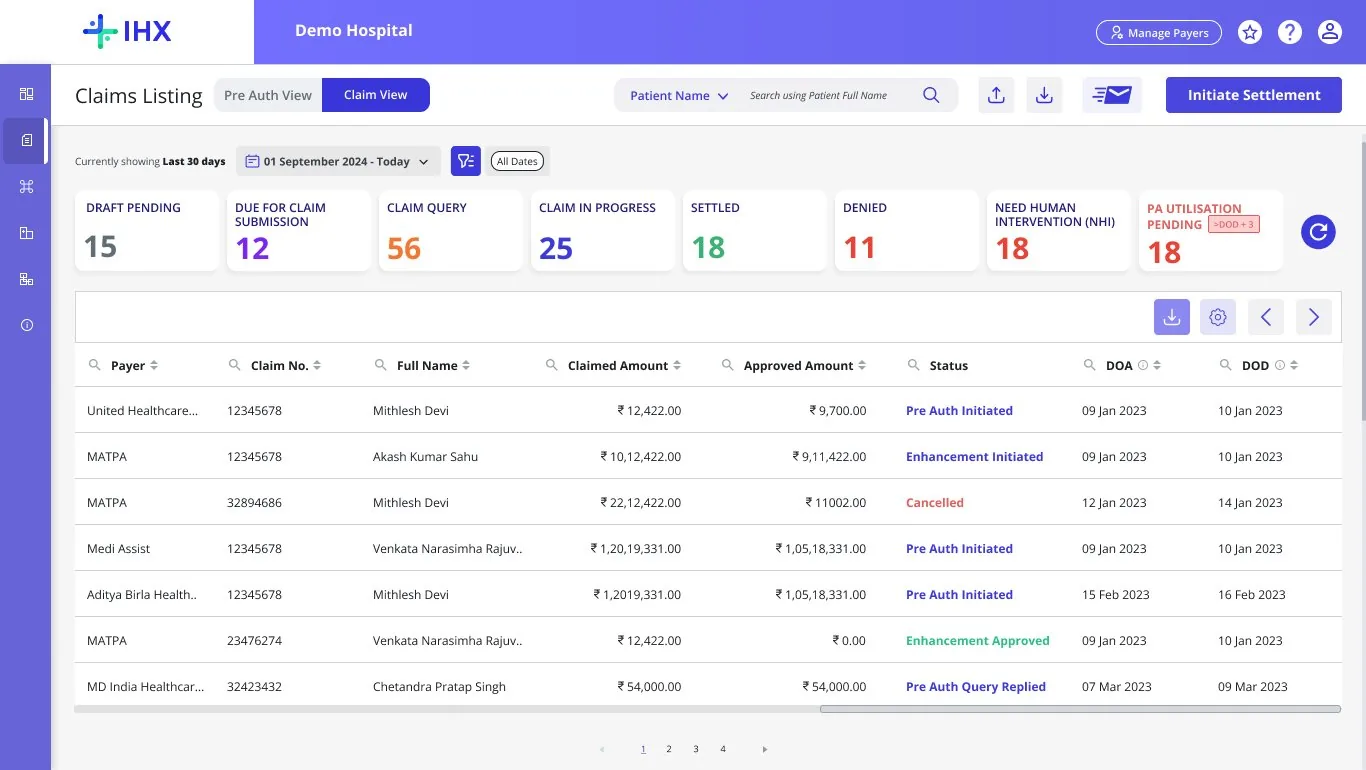
    Visual design: nested bucket hierarchy with consistent visual cues across all modules

    The bucket card (primary label, count, urgency indicator, secondary filter chips) communicates stage, volume, and action at a glance. Colour coding is consistent: indigo for approval states, amber for queries, teal for discharge, red for denied. The same component was reused across PA View, Claim View, Government Scheme, Self-Funded Corporate, Recon Module, IHX Mobile App, and Reporting & Analytics, with no additional design or dev work.
    PA ViewClaim ViewGov SchemeSelf-Funded CorporateRecon ModuleReporting & AnalyticsIHX Mobile App
    PA View Claim View
    Visual Design · Scalable Modular Design · Hierarchy
    03
    Secondary filters evolved from single-select chips to checkbox multi-select

    Initial design used horizontal tag chips, clean for single selections. Testing revealed supervisors needed to select multiple statuses simultaneously. Evolved to checkbox-based multi-select in a dropdown, which serves both the staff member needing a focused filter and the supervisor needing a cross-status overview.

    Testing-Driven Change
    04
    Handling search errors · cross-view search results

    Splitting views created a problem. A Claim Number search in Claim View will return empty results because the claim lived in Pre-Auth View. Fix: when a search returns no results, the platform shows how many results exist in the other view with a direct link to switch. One line of copy. Now one of the most-used interaction patterns post-launch.

    Core Design Decision
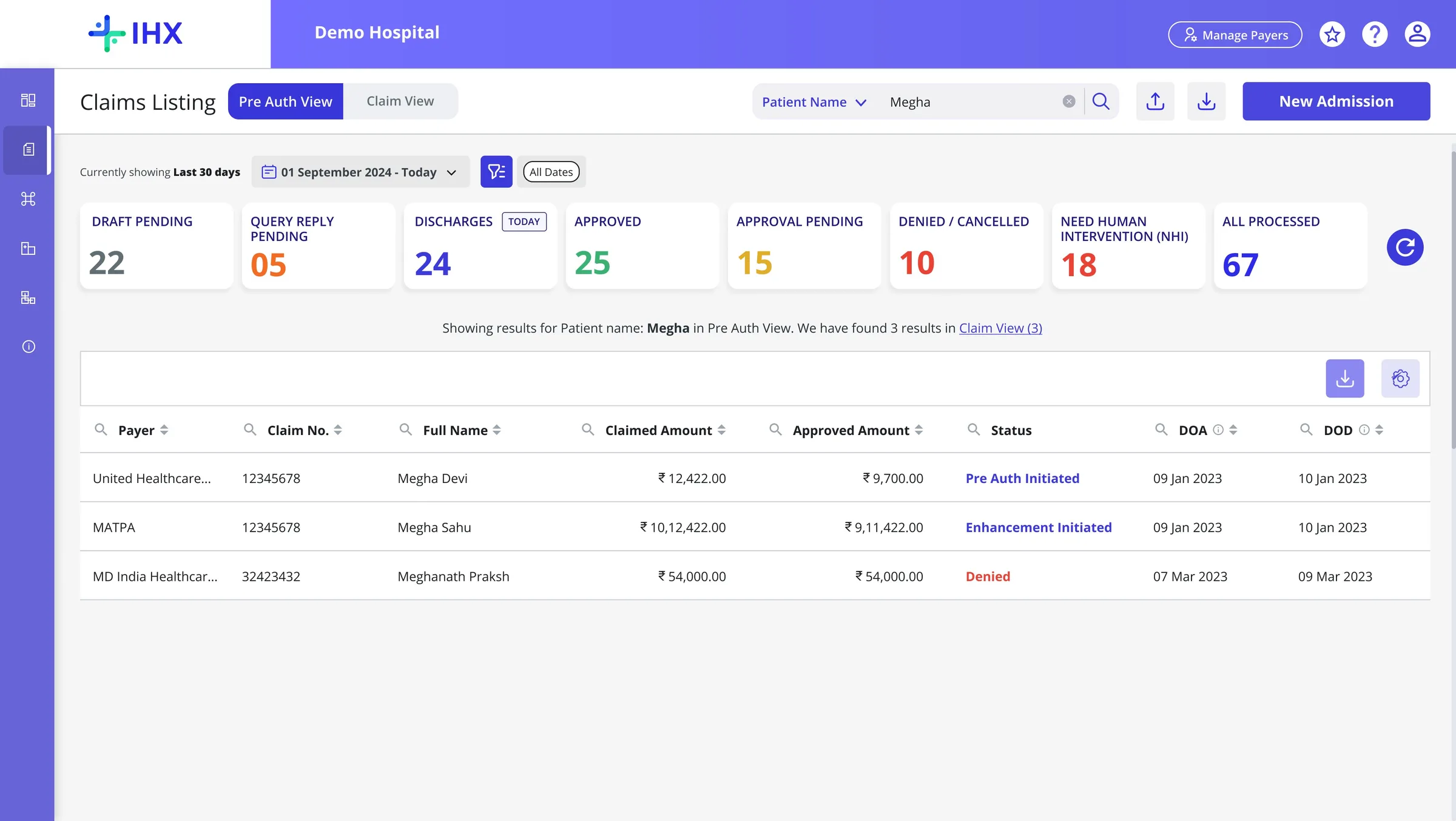
    Error handling
    05
    The Follow-Up Feature · increasing platform stickiness

    One of the points users were leaving the platform was to follow up with payers on delay in approval pending cases. A feature was introduced: email follow up through CTA under actions column inside the claim listing screen against cases along with the elapsed time.

    Platform Stickiness Feature
    06
    Filtering by Time & Date

    Searching claims by patient name returned everything (claims from origin onwards), forcing users to manually sift through noise. We added a time period and date filter with hierarchical claim date types, letting users surface only relevant records.

    Testing-Driven Change

    What I worked around, held on, and let go.

    Four situations from this project where the decision was not straightforward.

    Engineering Constraint
    Search: global search was infeasible. I used GA data to figure out what to build instead.
    Shipped
    Situation

    Hospitals had been requesting global search since the platform launched. Engineering assessed ElasticSearch as infeasible: too expensive and architecturally complex at this database scale. The constraint was real and non-negotiable.

    How I Approached It

    I pulled Google Analytics event data on column-level searches. Patient Name: 68% · Claim Number: 20% · UTR Number: 12%. Over 80% of searches fell into three parameters. Rather than accepting a blank space, I built scoped search across those three: data-backed, constraint-aware, and faster in practice for the most common use cases.

    Result

    Scoped partial-match search across Patient Name, Claim Number, and UTR Number. Zero additional infra cost. Covers the real use cases.

    Stakeholder Management
    One enterprise hospital pushed to remove the Discharge bucket entirely. I held the line. They signed anyway.
    Client Retained
    Situation

    During testing, one enterprise hospital pushed hard to remove the Discharge bucket and replace it with a secondary filter. Their workflow had specific reasons for this preference. The account manager was under pressure to accommodate them.

    How I Approached It

    The platform serves thousands of hospitals on a single interface. Accepting one hospital's structural preference would create inconsistency for every other hospital and a long-term maintenance problem. Four other hospitals in the cohort confirmed the Discharge bucket structure was right for the majority.

    Result

    I held the line, communicated the reasoning through the AM, and documented the feedback. Platform IA integrity maintained. Feedback on the roadmap.

    MVP Scope
    Settlement in bulk was painful. We designed it. We did not ship it.
    Deliberately Deferred
    Situation

    Hotjar confirmed Claims team was doing bulk settlement case by case every evening, a real operational cost. We had designed the bulk workflow. Engineering capacity and stable IA shipping took priority for the MVP.

    How I Approached It

    The decision was deliberate, not a compromise. Shipping an unstable bulk feature alongside a structural redesign would have introduced risk on two fronts. The IA needed to be proven stable first. Bulk was documented and roadmapped for v2.

    Result

    MVP shipped stable. Bulk Settlement confirmed as v2 priority. Deferring it was a decision with a reason and a record, not a gap.

    Design Thinking · Platform Stickiness
    The Follow-Up Feature: from workflow improvement to contract requirement.
    Contract Secured
    Situation

    Hospital staff were leaving IHX to send follow-up emails from their inbox when claims sat in Approval Pending with no insurer response. Every exit broke the workflow.

    How I Approached It

    The feature itself was straightforward. The real design work was the configuration layer. A fixed system default would have been wrong for most hospitals: different insurers operate on different timelines, each hospital has its own MOU with each payer. The elapsed time is configurable per payer in Manage Configuration.

    Result

    Staff send follow-up emails directly from IHX without leaving the platform. Configurable per payer. This feature was a dealbreaker for several enterprise hospitals during contract negotiations. Not a nice-to-have. A requirement to sign.

    Through-Line
    Three things that ran through every decision here
    Use data to answer design questions, not just validate them.

    Search decision came from GA. Stakeholder pushback was settled by cohort testing. If I can get data, I get data first.

    Platform decisions have to hold for everyone, not just the loudest user.

    One hospital's workflow preference cannot drive structural changes to a platform used by thousands.

    Deferring is a decision, not a failure. It needs a reason and a record.

    Bulk Settlement was ready. It was deliberately deprioritised and added to the v2.

    The numbers matter. So does understanding which decisions produced which outcomes.

    Four situations from this project where the decision was not straightforward.

    Revenue Per Claim
    ↑33%

    INR 90 to 120 per claim on one enterprise hospital contract, with the new Ops Dashboard as a premium feature

    Enterprise Contracts
    3

    Group hospital contracts secured. The follow-up feature was the dealbreaker

    CSAT Score
    4.6

    Improved customer satisfaction post-launch

    4000+
    Clicks in 30 days across 10 pilot hospitals
    51%
    Reduction in avg time on task · 3.23 min to 1.56 min
    34%
    Increase in task efficiency

    Learnings

    Understand the full user journey. Do not assume.

    Diving deep into the journey to capture all frustrations and requirements before designing. The brief was wrong. The Hotjar data told a different story.

    Design with purpose. Evolve with feedback.

    Test, listen, and iterate. Prioritise usability: aesthetics come second to function. The multi-select filter was a testing discovery, not an assumption.

    Data-driven decisions.

    Make design choices based on data, user feedback, and business goals, not just intuition. The scoped search solution came directly from GA event data.

    Need a designer to bring clarity to your workflows?Talk to me.

    Open to product design roles and contract work.

    Download resume
    Business Card.json
    1. {
    2. "name": "Shabnam Raghavan",
    3. "title": "Product Designer",
    4. "email": "shabnam.rs.work@gmail.com",
    5. "phone": "+91 70226 65338",
    6. "link": "linkedin.com/in/shabnamraghavan"
    7. }